Anthon Berg Packaging
Structural packaging for Anthon Berg Chocolate Liqueurs, built around Norse mythology.
Structural Packaging
Structural packaging for Anthon Berg Chocolate Liqueurs, built around Norse mythology.
Structural Packaging
Anthon Berg's chocolate liqueurs needed structural packaging built around the brand's Danish heritage rather than generic decoration. The design is based on Norse mythology, specifically the Vegvísir — an eight-directional compass symbol used as the box's octagonal form.
Since the chocolates themselves are shaped like miniature bottles, the outer packaging mimics that same silhouette rather than working against it. Structure carries the narrative here, not surface graphics.


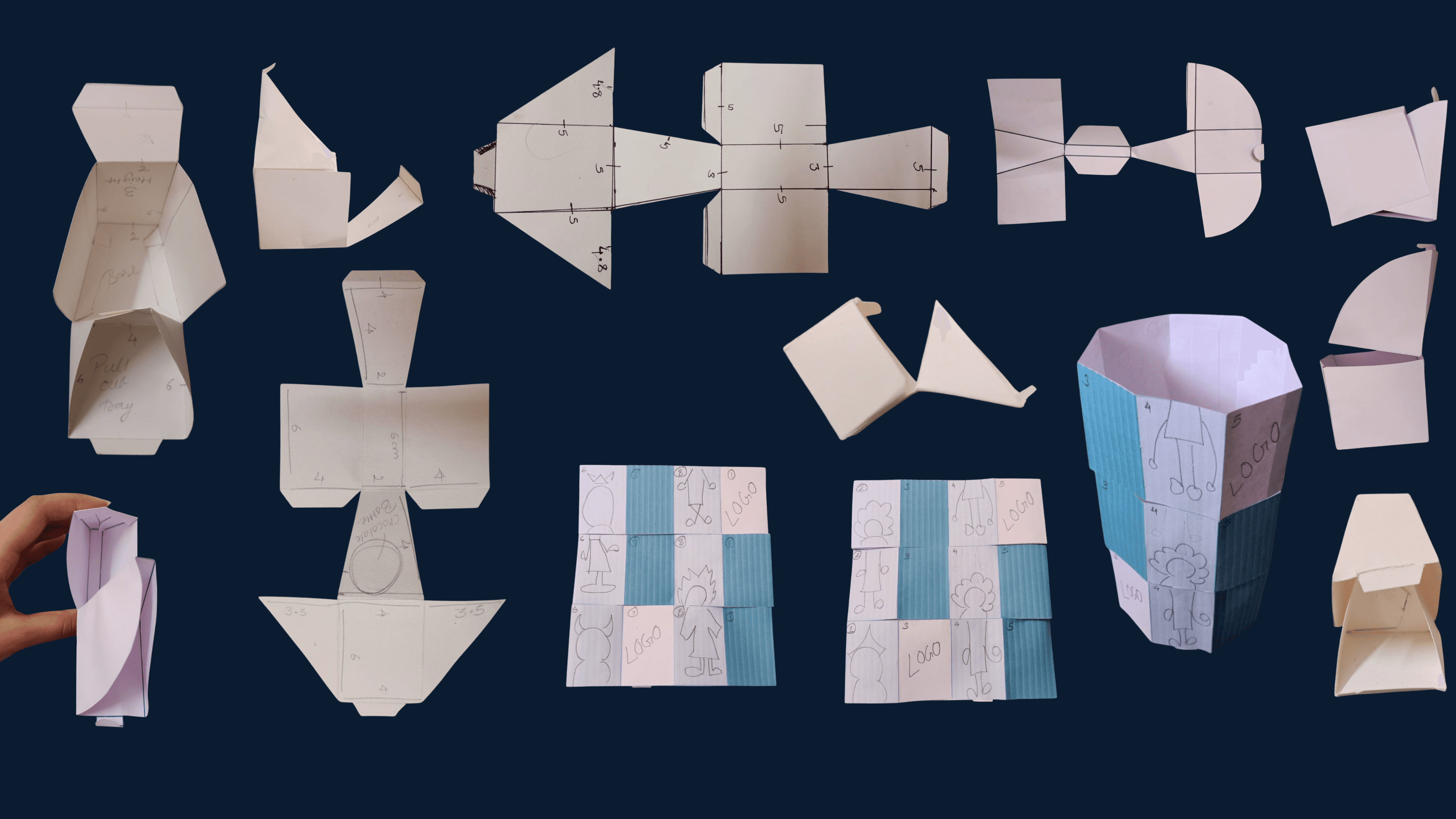
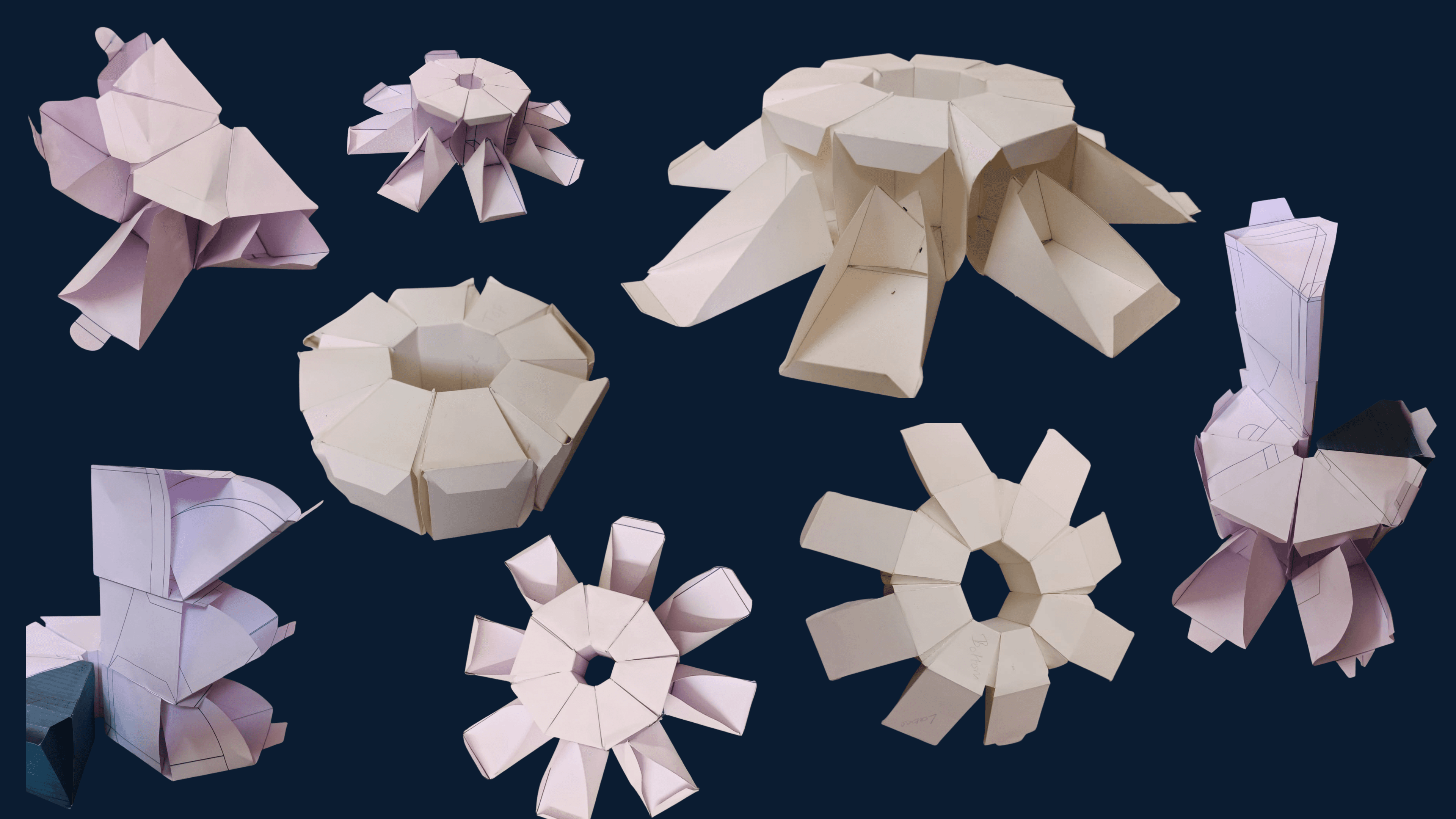
Development started with the structural form before any surface design, since a folding box like this succeeds or fails on mechanics, not decoration. Paper prototyping came first — physical mock-ups tested well before digital renders entered the process. Each fold pattern was assessed for stability under handling, ease of assembly, and how well it protected the bottle-shaped chocolates inside.
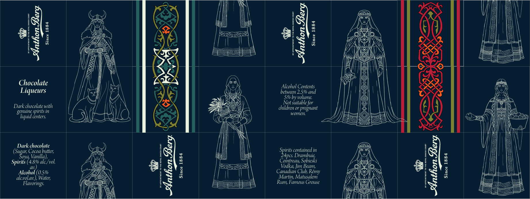
Once the octagonal petal-fold with a locking lid proved structurally sound, surface design moved forward: four line illustrations of Norse goddesses in an engraving style, set against navy, with Celtic knotwork functioning as ornamental dividers between panels.
Four structural directions were tested in paper: a circular petal-fold, a hexagonal form, a stacked modular system, and multiple locking mechanisms. Each version got evaluated against the same criteria — stability, assembly ease, protective capacity for the bottles inside. Most looked viable flat on paper but failed the moment they were folded and handled. The octagonal petal-fold with a locking lid was the only structure that held up consistently across repeated assembly tests.
The final packaging is an octagonal petal-fold box with a locking lid, printed with four hand-illustrated Norse goddesses set against deep navy. Celtic knotwork sits as a dividing motif between each face, reinforcing the mythological framework without overwhelming the illustrations.
A hand-assembled physical prototype confirmed the structure worked at production scale, not just as a flat digital render.
Building the structure in paper before touching a screen turned out to be the most valuable part of the process. Digital tools offer control, but paper prototyping reveals what actually holds under real handling and what collapses at the first fold. Testing structural viability early prevented wasted time refining surface illustration on a form that wouldn't have worked in production anyway.





Goddess Freyja
Goddess Frigg
Goddess Idun
Goddess Sif
Illustrated nordic pattern
Paper Prototypes