Cadbury Rebrand
A full brand manual repositioning Cadbury as a luxury, craft-led sub-brand, built around rural Indian craftsmanship, heritage storytelling, and eco-conscious packaging.
Branding and packaging
A full brand manual repositioning Cadbury as a luxury, craft-led sub-brand, built around rural Indian craftsmanship, heritage storytelling, and eco-conscious packaging.
Branding and packaging
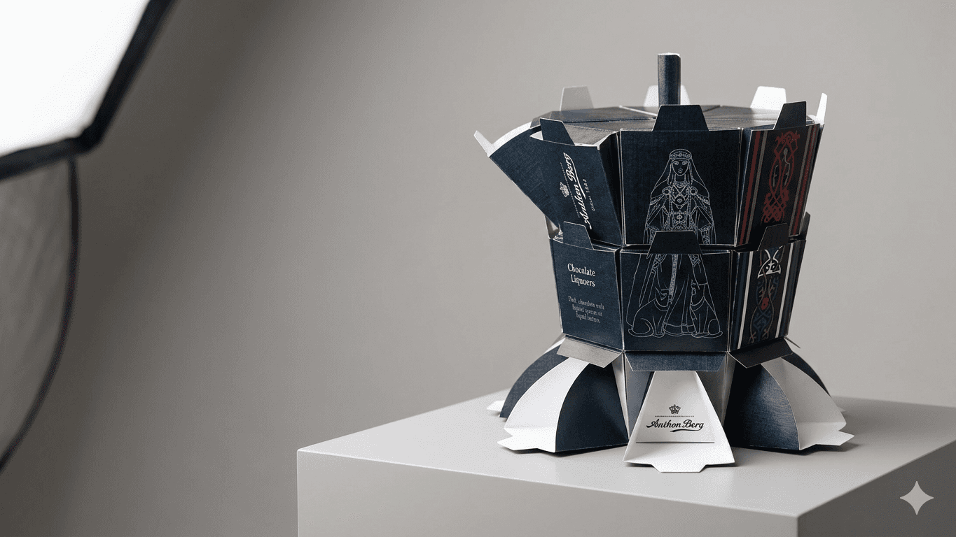
This project repositions Cadbury as a luxury sub-brand, built around rural Indian craftsmanship, heritage storytelling, and eco-conscious packaging. Rather than treating the chocolate bar as a mass-market snack, the identity ties it to a specific place, specific artisans, and a specific production story.
The goal was shifting perception from familiar and generic toward premium and intentional, without abandoning what still reads as unmistakably Cadbury.

Work began by questioning what Cadbury's narrative could become if it leaned into craft and origin instead of staying broad and mass-appeal. The existing identity read as warm but not premium, so before any visual decisions, the brand's positioning needed defining first.
Every subsequent choice, be it the colour palette, typography, or packaging material, was tested against that positioning rather than aesthetic preference alone. This meant repeatedly asking whether a direction still felt like chocolate carrying a cultural story or whether it had drifted into generic luxury branding disconnected from the concept.
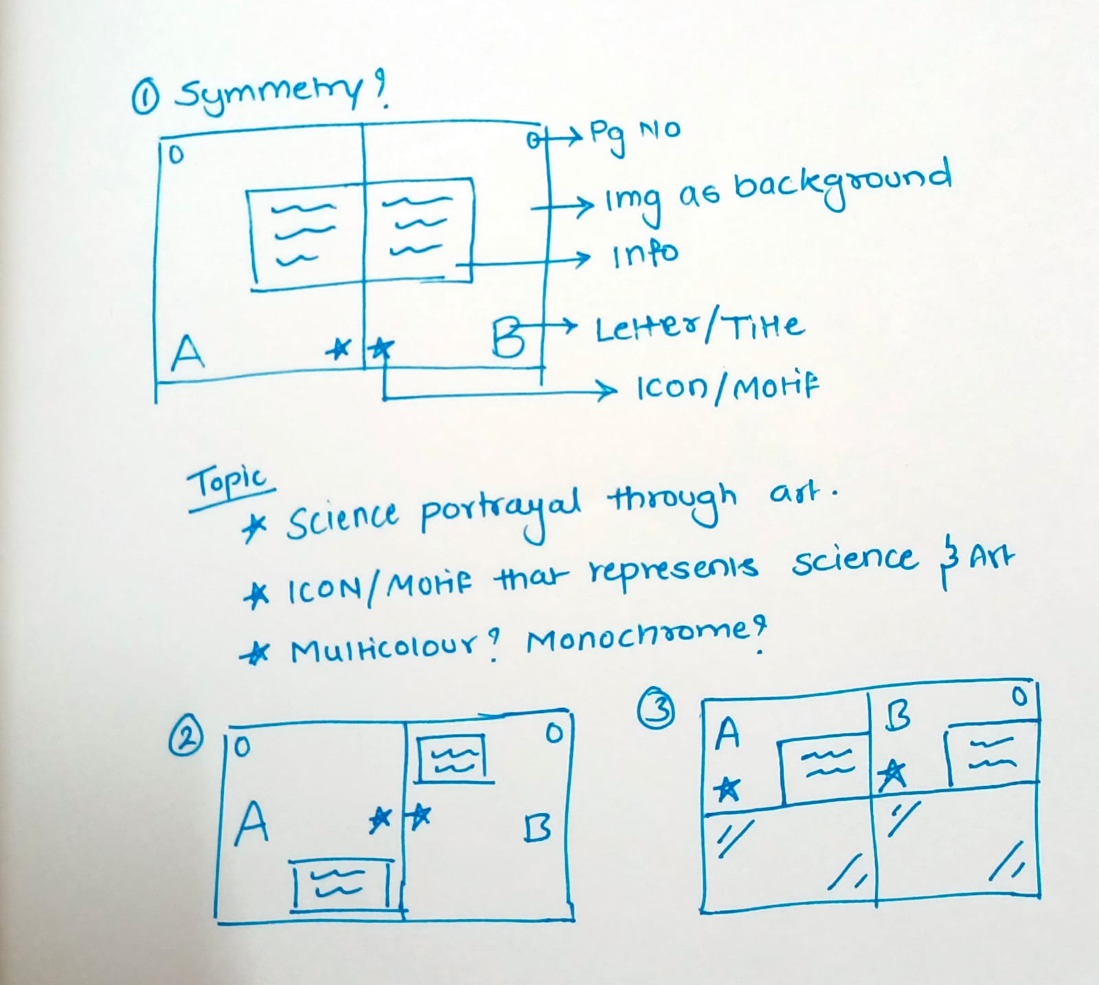
Three colour directions were tested before settling on deep cocoa browns paired with aged cream, chosen for how closely they aligned with the craft and heritage angle over cooler, more corporate palette options. Typography went through several pairings, like a classical serif paired with a cleaner secondary typeface, etc., until the combination felt warm without losing premium weight. Logo explorations pushed toward simplified linework before arriving at the final wordmark, which needed to read as heritage-driven rather than decorative.

The final brand manual pairs a serif primary typeface with a clean secondary, built on a palette of deep cocoa brown and aged cream. The wordmark carries the craft-heritage
direction across every touchpoint, from packaging to supporting collateral, giving the rebrand a consistent visual language rather than a single standout asset.
The hardest part of this project wasn't building the visual system; it was deciding what the brand actually stood for before making a single design choice. A brand manual only functions if it protects a clear idea rather than a loose collection of nice-looking assets. Every decision was dependent on one question: Does this still feel like chocolate with a cultural story? It kept the direction disciplined instead of decorative.