
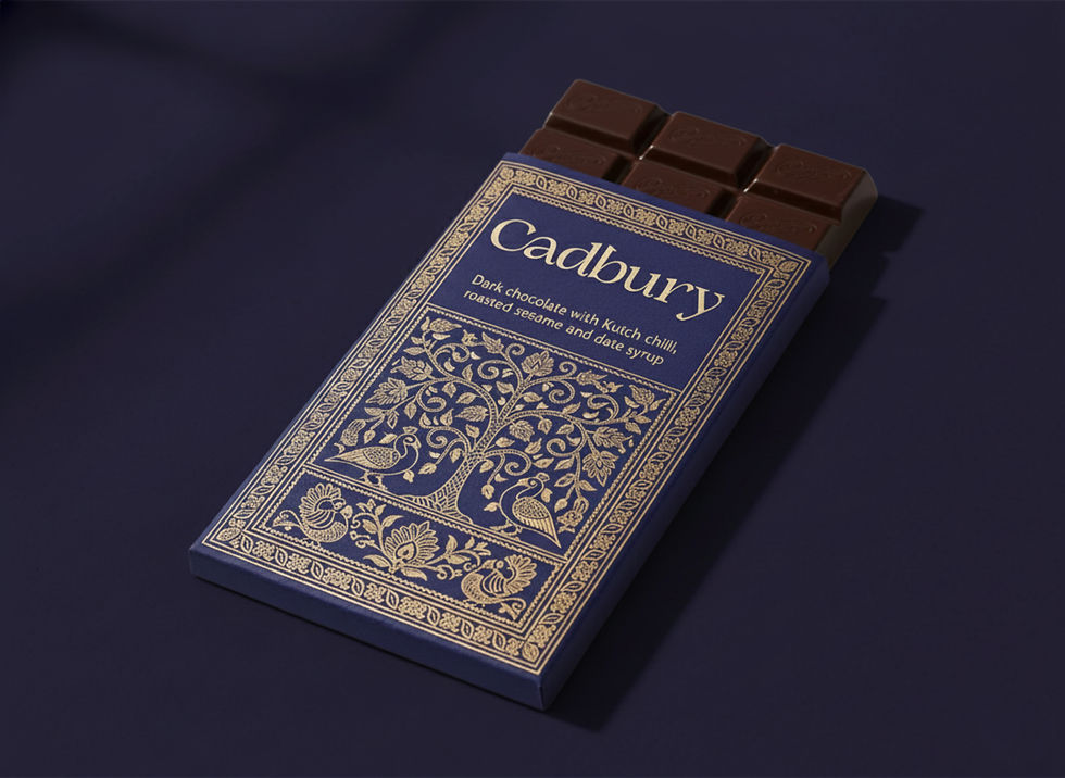
The Concept:
Cadbury is repositioned as a luxury sub-brand that fuses rural Indian craftsmanship, eco-conscious packaging, and heritage storytelling. Each chocolate bar is transformed into an experience centred around the people, place, and purpose.


Iterations & Process:
The project for Cadbury began with the question of redefining its narrative, emphasising craft, origin, and the people involved. Early explorations of the brand’s identity showed that the current visual language, while warm, was not able to communicate a luxury craft direction.
Three iterations of colour palettes were developed, concluding with deep cocoa browns and aged cream. Typography was refined for a classical yet warm feel, with a serif primary and a clean secondary.


Logo Explorations
Final Wordmark
Key Takeaways:
The most interesting design challenge in this project wasn't building the system; it was deciding what the brand stood for before a single visual decision could be made. A brand manual is only as strong as the idea it's protecting. Before making any decisions, the vision had to be clear: does this feel like a bar of chocolate with a cultural flavour? If so, hold onto it. Cut it if not.

