Anacare Case Study
Clinic posters and social media templates for Anacare, designed to connect an already-operational NGO with a community that didn't know how to reach it.
Print and Editorial
Clinic posters and social media templates for Anacare, designed to connect an already-operational NGO with a community that didn't know how to reach it.
Print and Editorial
Anacare is an animal NGO operating in Mumbai, and this project addresses the disconnect between the organisation and the community it serves. Mumbai holds an estimated 95,000 street animals alongside a population of over 20
million people, most of whom don't know how to respond when an animal is injured or in distress. The gap here isn't a lack of care — it's a lack of communication reaching the right audience at the right moment.


Anacare's brand – website, colour palette, and logo – was already finalised before this project began, so redesigning the identity wasn't an option. Instead, the work required reverse-engineering a coherent visual system from what already existed, identifying what functioned well and what needed formalising within those fixed constraints.
Research meant visiting the clinic directly, observing how the space was used, and mapping the team's actual workflow to locate where communication was breaking down. Four distinct audiences emerged from that research: clinic visitors, potential adopters, the social media following, and the Anacare team itself, each needing a different kind of communication support.
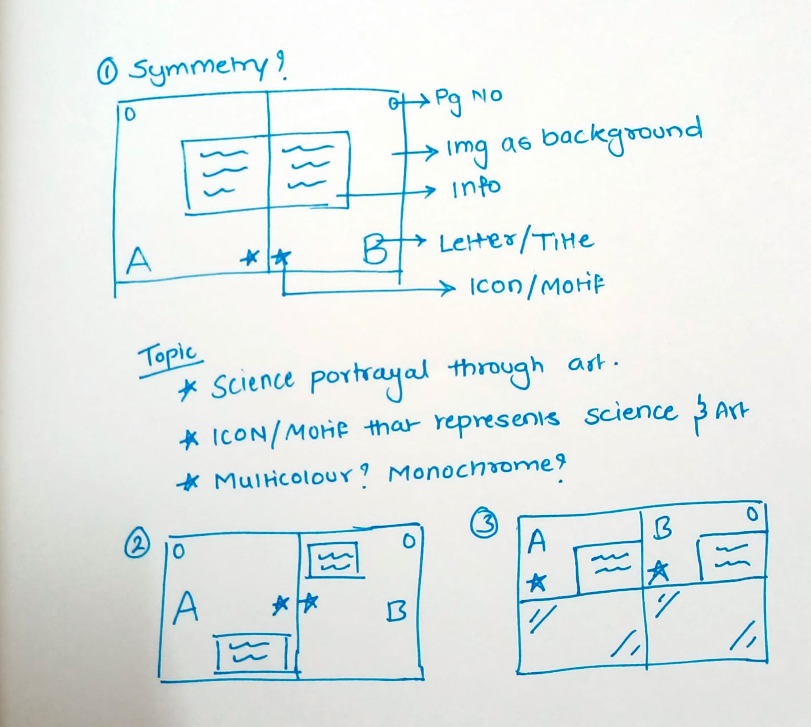
The work split into two phases based on audience need. Phase one addressed the clinic directly — six to eight A4 posters covering myths about street animals, correct approaches to handling scared dogs and cats, and the adoption process, designed for quick readability in a physical space. Phase two shifted to Canva-based social media templates, built for rescue stories and awareness content the team could produce without extensive design input each time. Both phases went through several drafts to strip unnecessary text and prioritise scannability, since neither format allows for lengthy explanation.

Phase one delivered a poster set installed at the clinic, addressing the most common points of confusion visitors and volunteers encountered.
Phase two produced a template system in Canva, paired with a workshop so the Anacare team could maintain consistent social media output independently, without relying on outside design support for every post.
Good design doesn't always mean building something new, sometimes it means understanding existing constraints and working precisely within them rather than against them. Systems built to outlast the designer's involvement matter more than any single deliverable looking polished. Constraints imposed by a pre-finalised brand forced a level of precision that a blank slate wouldn't have demanded.