Safar App
A UI/UX concept consolidating Mumbai's fragmented train-commute apps — station lookup, schedules, and ticketing — into a single streamlined flow.
UI/UX
01: Concept
Mumbai's railway network connects the city end to end, letting locals commute faster and cheaper than almost any other mode of transport. Despite how essential the system is, navigating it means relying on multiple separate apps, each covering only part of the journey.
This becomes especially difficult for newcomers and outstation visitors unfamiliar with the network. SAFAR was built as a single app handling station navigation, ticket booking, and train tracking, aimed specifically at commuters who don't already know the system by habit.

02: Process
Research started with interviews and a survey of 30 people, which pointed to six recurring issues: confusing navigation, overcrowding, safety concerns, poor accessibility, weak last-mile options, and dirty stations. Next came a competitor analysis, comparing Yatri, M-Indicator, and UTS.

03: Iterations
Wireframes were built based on the site map and went through a few rounds of edits, mainly around what info, train status, platform number, and fare needed to show up first on each screen.

04: Outcome
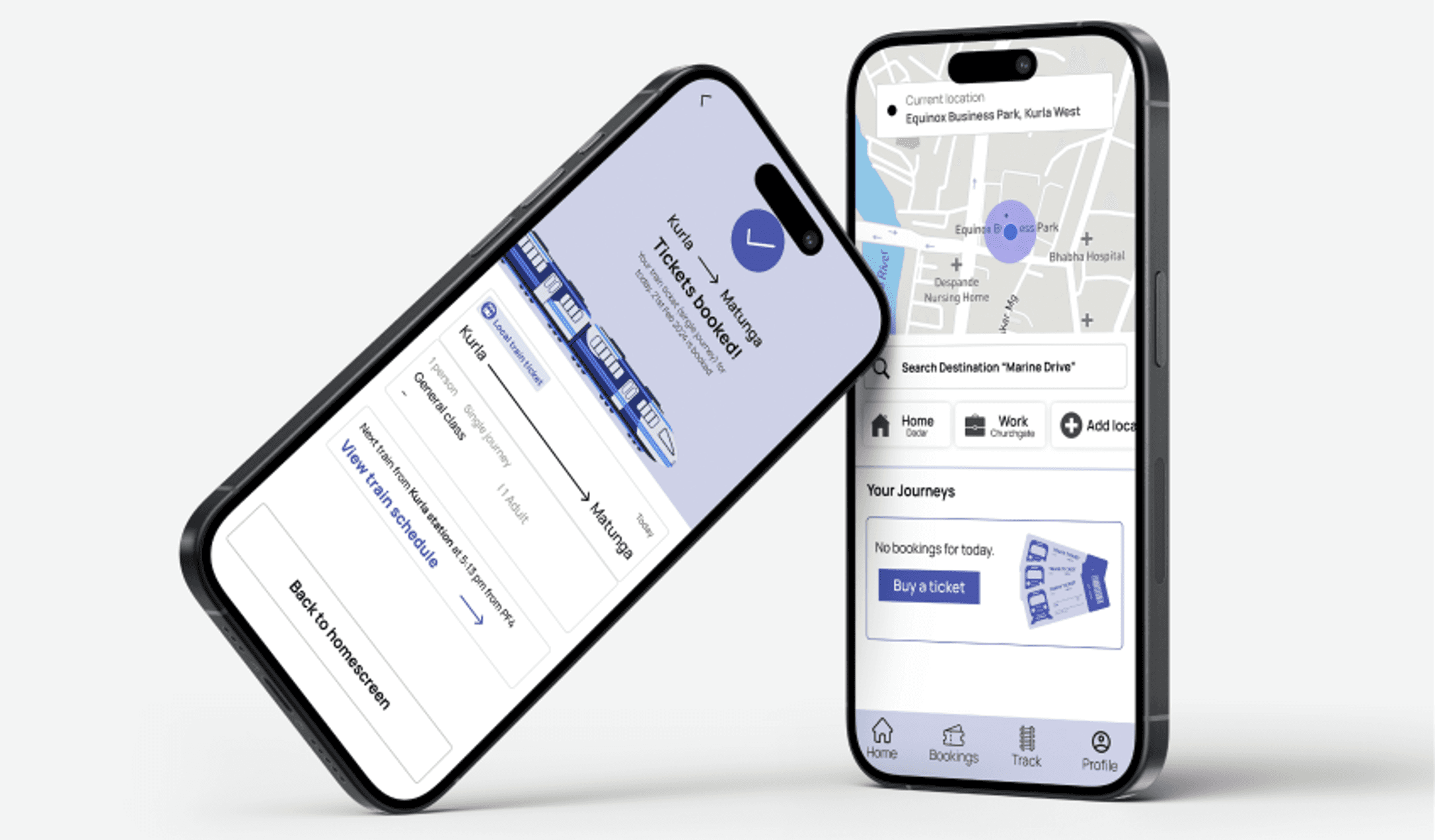
The final app opens on a live map with the user's current location, a search bar for the destination, and a journeys section that prompts you to buy a ticket if you don't have one booked.
05: Key Takeaways
Good design doesn't always mean building something new, sometimes it means understanding existing constraints and working precisely within them rather than against them. Systems built to outlast the designer's involvement matter more than any single deliverable looking polished. Constraints imposed by a pre-finalised brand forced a level of precision that a blank slate wouldn't have demanded.
Yatri has clean navigation and real-time tracking but no ticket booking. M-Indicator covers multiple transport types but feels cluttered and confusing. UTS handles ticketing fine, but the app performance is poor. None of them do everything, which is the gap SAFAR is meant to fill.
Four personas were built to cover different types of users, not just the daily commuter.


Khushal is an NRI visiting his hometown. He's used to train travel but finds the signage and scheduling confusing.


Anita is an elderly retired teacher who struggles with stairs, finding a seat, and unpredictable train delays.
Task flows were mapped next, covering the full journey from pre-travel planning to boarding, including separate paths for general, ladies, first class, and accessibility coaches.

A user journey map traced the emotional highs and lows across five stages: start, travel, station, train, and destination, from booking a ticket to finally exiting toward the destination.

Then came the site map, laying out the whole app structure: onboarding, homepage, journey planning, live tracking, ticketing and payments, and station facilities.
